
International Power, ACT
PRACTICAL EXAMPLE #7 - DESIGN
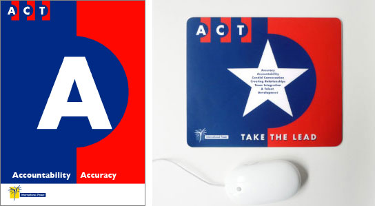
The brief: To articulate the company's core values visually.
2008
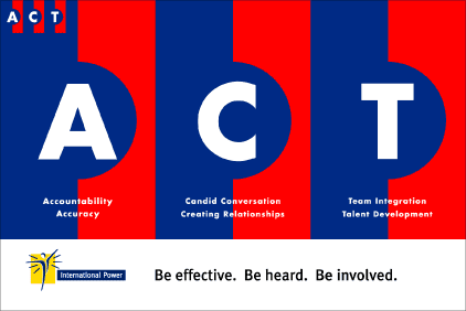
ACT poster
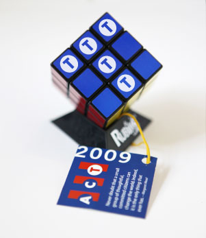
2009
The leadership team focused their attention on the T. Talent Development and Teamwork.

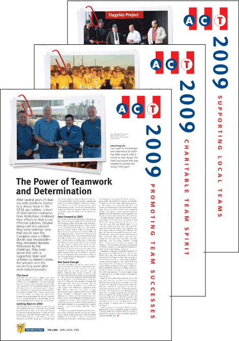

Attendee booklet cover
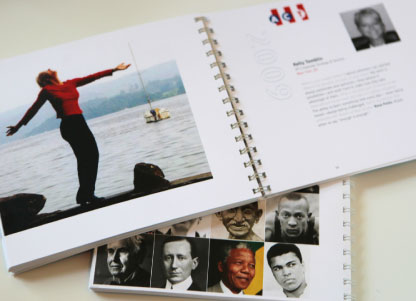
Attendee Booklet inside
2010
The recognition scheme was launched.
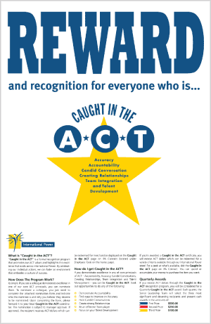
I added the REWARD and Recognition headline and based the design on the old wild west wanted poster.
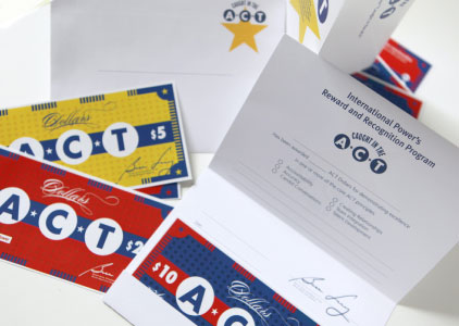
ACT dollars and certificates
 000001