The thought process

The client wanted an outdoor piazza feel. I didn't want to recreate a sky, but I took the essence of what I thought a sky was about–something amazing overhead that changes depending on the direction you are looking from–and went from there. The suspended panels were painted with different colors on the fronts vs the backs, so that the overhead colors changed from when you entered to when you left, and varied depending on where your table was situated.

model
Photograph of my scale model used in the business plan

foor before

This is the ceiling before I got my hands on it.

actual
The empty shell before I raised half the floor

I designed the floor in a random pattern of large grey and brown ceramic stone-like tiles to look like paving yet still practical for staff to walk on and keep clean. Cobblestone texture was introduced around the base of the pillars where you would never actually step.

I am not an architect, but I do understand space and by building a scale model have always found that I am able to communicate very clearly with contractors what we are trying to achieve. I studied technical drawing at school, so am capable of detailing plans and elevations of non-structural elements, as well as specifying materials and finishes accutately enough for carpenters and fabricators to follow. This is particularly useful when I design built-in seating, bars and counters.

model

For surfaces. I made use of a lot of colors. The biggest impact in the space were the edge-to-edge photographic murals throughout the dining room. I had a building in Trento photographed because its entire exterior was hand painted. This made the photographic murals ambiguous. They were both real and painted.


reference

reference

I drew on references directly from Italy. Both of these images (above) influenced the design. I worked with an amazing designer/ architect, Nick Fasciano, who fabricated everything from the bar to the suspended ceiling to the canopies and a gazebo which he designed for the terrace.

bar tiles

up arrowThe bar top was tiled with these blue-green one-inch handmade ceramic mosaic tiles. The color was irregular and incredibly rich and reflected blue highlights in the mural. The marketplace countertops were surfaced with half inch penny tiles. down arrow


penny Tile detail from a countertop. The wood was naturally this color. Nick suggested it.


I used a lot of iron work throughout to make the outside theme stronger. The ceiling was really high so, at the client's request, I built a wine cellar on top on the vestibule, with a decorative spiral staircase for staff access.

mural

I used mirrored wallpaper on the back side of the arches to reflect the building mural in the same way that modern glass buildings do in cities.

Nicola wanted to sell fresh pasta and breads in a marketplace setting, so I designed canopy stations around and near the brick oven.

The traditional brick oven was built by an Italian artisan oven builder, flown in specially. I was asked to design the brick patterns which he then built. The restaurant was on the second floor and had to have an extra steel structure added to support the enormous weight of the traditional oven.


AtlasPark

arrrow This is one of the four sides of the Atlas Park development that featured a park with interactive fountains in the center.


What the clients said:

"Customers responded to the design and quickly became regulars. It was particularly popular for wedding parties."

Pasticcio


PRACTICAL EXAMPLE #10 - RESTAURANT DESIGN

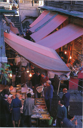
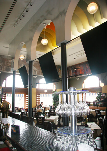
The brief: Design (from scratch) an Italian restaurant inspired by an outdoor marketplace. 5000 sq feet. New building, with a terrace. Nine month build out.
$1.5m budget.


model

model

floor

bar


XXX

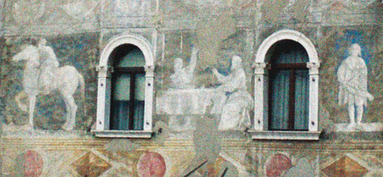
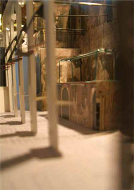
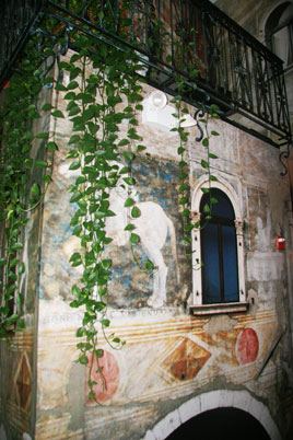
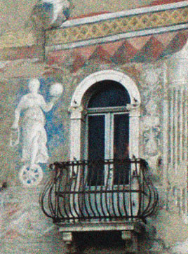
Fogolino's beautiful fresco on Casa Rella in Trento

spiral
.ironwork


elevation


oven
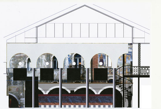
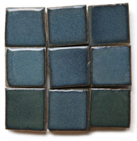
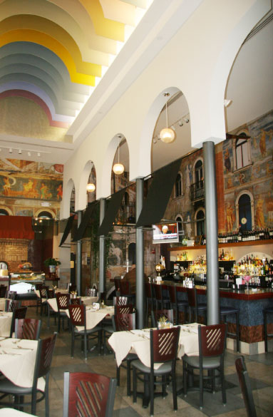
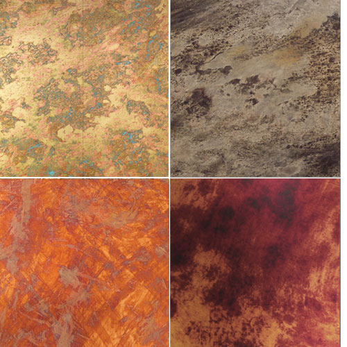
Brick colors were influenced by murals

..mural


floor

up arrow

This was a sketch for a mosaic floor that I considered for the bathrooms


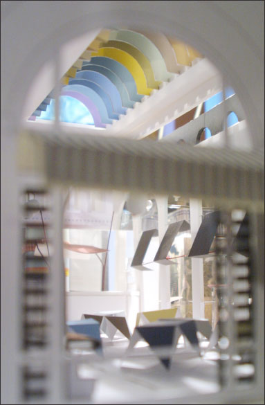
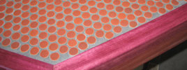
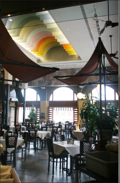
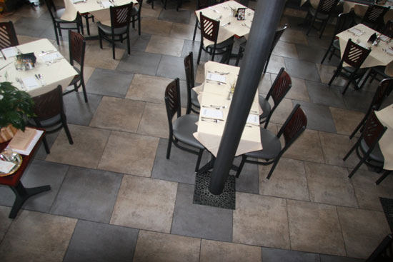
Table tops were designed to be used without table cloths during the day. From a practical and environmental perspective this reduced laundry significantly and aesthetically and experientially, and gave the restaurant a very different feel during the day. arrow

tabletop
Tabletops were metal Chemmetal veneer with purple cherry wood edging

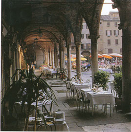
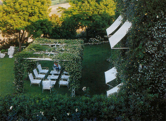
For the balcony, which added another 1200 square feet, I wanted a lot of greenery climbing up the wall and hanging heavily over lazy awnings. I was inspired by this photograph (below)

terrace


I'd like to know if you found any of the content on this page interesting or informative–please click on the smile if you did.

smile000001Thank You :-)