The thought process

To make an electronics catalog entertaining, useful and therefore more effective.

Initially, I took the content from the previous year's catalog as my raw material. I cut it up metaphorically and reorganized it from a customer's perspective. Grouping products into amazing (the opening spread), amusing (final spread), accessories, fashionable colored tek, and so on...
taxi key drive

The concept tied the catalog together and related to the ad campaign–gift ideas for New Yorkers (and anyone else who knows one). It was done with humor and an inside knowledge of New York life.

left arrow
The device used was the Mac speech bubbles from the ipod ad (#3). The cover of the catalog was covered with questions, in white bubbles, intended to be from people looking for the perfect gift... "For the person who can never find a taxi?" and "For the person who follows Weather on the 1s?" and "For the person who loves dogs?" Inside the catalog were all the answers in green bubbles (the reply color) with exactly the same words minus the question mark. In every case "the person" could be interpreted as anybody. By focusing on characteristics, I opened interpretation up to the customer. A fitness fanatic could be your sister, your uncle, your granparent, your partner or your pal. Counterintuitively, by being more specific, it opened up the more possibilities than the more commonly-used approach "For Dad," which actually narrows things down.

one and one equals two
A didactic illustration of the product in the middle

Aside from supplying answers, the catalog also provided useful tips–like why you can't use a touch pad with ordinary winter gloves on. How to double the life of your battery, and what to use to turn a vinyl collection into digital.

I introduced other New York institutions from Rolling Stone to DC Comics, and great props like handmade drums from around the world as played by street musicians, and a purple poodle I once met.

manhattan mighty storage

A play on Manhattan Mini Storage

left arrow
Making something that is visually uninteresting (storage drives) look interesting and making something frivolous and cute work harder to convey the main message of the page.
left arrow

face

A big happy face on the amusing products page helps define the content of the page if the reader is flicking through the catalog quickly


up arrowFor the person who loves dogs, I made screensavers of superdog desktop pictures shown and made them available for absolutely free, with no purchase needed. Genuinely in the spirit of the season.


left arrow
Tekserve are proud of their extensive range of bags. The catalog had very limited space for bags, so rather than show just a couple, I shot them this way so that the customer got a feel for the full range, encouraging them to visit the store.


up arrow

The cityscape was a very dramatic way to make a statement about the extensive range of cases available. Even though the products are layered on top of one another and in front of each other the lighting and the layering actually help understand the products better. If it was transparent you can see through it whereas a straight product doesn't convey this nearly as well. The same applies to the metallic ones, the moulded ones, and the patent leather ones - the lighting makes them appear even more attractive.

This layout doubled up as an instore poster.

I proposed a decorative and functional signage program for the store using the bubbles as shelf talkers and hanging signs to inform customers that prefer to browse through the store without staff assistance. It would also bring the catalog to life in a larger-than-life visually stimulating way.

The program wasn't implemented, but perhaps this year...


What the client said:

...

Tekserve, Holiday Catalog


PRACTICAL EXAMPLE # 14 -DESIGN, ART DIRECTION AND CREATIVE WRITING

The brief: design a 20-page holiday product catalog.

questionshand
Who do you need to find the perfect gift for?

amazing


headphones


iMac


Unlike the digital world, in a printed catalog you can control scale. I wanted the reader to clearly comprehend the size of the iMac monitor so I printed it at actual size across the whole spread and put a wee notation saying plus 9 inches. So when you held up the catalog you could feel the size.

actual size
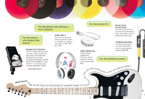
Printed actual size accross two pages

poodle


left arrow
I suspect that the only other place you would find a purple standard poodle is the Emerald City. I met this one in my bagel store a few years ago and never forgot it. It appeared in the catalog only as a tiny detail, but I knew New Yorkers who had seen it would smile.
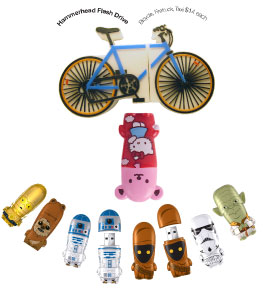


down arrowFriendly, intuitive and you can take them on the bus.

lapdogs

bags

Dancing headphones and iPod Shuffles, a New York cityscape of iPod and iPad cases, a tower of bags. The still shots I wanted to do fell outside the budget, but inspired the stylist, Marianna Eppik, and photographer, Robert Christensen, to shoot them as portfolio pieces. Everybody wins.


Tekserve has enough iPod and iPad cases to satisfy a small city.

skyscape


I'd like to know if you found any of the content on this page interesting or informative–please click on the smile if you did.

smile000001Thank You :-)