The thought process

Live Out Loud is a LGBT youth mentoring organization.


Emile Zola quote


With a name inspired by this quote from Emile Zola, the founder, Leo Preziosi Jr., approached Milton Glaser for a logo. Milton and I worked on it together and came up with a logo that gets louder and louder.

The three words are one unit and yet are legible by being visually separated by the letters increasing in thickness. One of the qualities I like most about the design is, like the quote, it isn’t just about speech and speaking out, its also about the act itself. To live out loud.

To avoid a corporate, branded approach, I made no rules about its color. It could be any color you wanted. Whatever suited the situation. Its form was distinctive enough to allow its spirit to be free.

After the logo was done, I continued as Leo's designer (pro bono), doing everything he needed from postcards to event flyers, posters, donation forms. And every year, their annual Gala pack, including save the date, invitation, back drops and award certificates.

XXX
Envelopes, invitation, RSVP and poster

XXX

The basic design could be kept consistent and yet incorporate unique elements that distinguished that particular year.

certificate
Award certificate

Arrows within the design were symbolic of forging ahead and leading the way. Trailblazing.

XXX

winners'
Cherry Jones and one of the winners

winners

Each year, I allowed myself the most room to be playful on the save the date card. All the invitation and event materials followed a consistent design. This did four things. It meant that the materials could be put together very quickly (last minute) the moment when all the sponsors, donors, auction items and special guest hosts were confirmed. Secondly, it meant consistency - a consistently good design meant a consistently good event at a consistently good venue. Third, the package was instantly recognizable, inside and out so that it wouldn't be overlooked amongst the rest of the mail. Finally, the one significant variable was the color scheme, and this I let Leo guide. The colors cheme was then reflected in the flower arrangements and table cloths at the venue, the Chelsea Mueum of Art.

winners

Hal Rubenstein (far left), 2008 winners, Cheyenne Jackson (center), and Founder, Leo Preziosi Jr. (far right)

XXX

This trifold brochure, about how to get involved, featured people already on board from guest hosts to committee members, volunteers to scholarship winners, punctuated with blank holes invinting readers to fill with themselves.

XXX

detail


Throughout the year there were many smaller events, talks, competitions, performances, etc... These posters and postcards were some of these I produced.

dance

A night out at a club

poetry

Poetry

Q&A
Urban Word writers workshop


What the clients said:

To come...


Live Out Loud


PRACTICAL EXAMPLE #9 - DESIGN

The brief: A logo.color and more color


logos


INVITATIONS

SAVE THE DATE 2007
back

The annual Gala was a celebration of Live Out Loud scholarships awarded to Trailblazing high school students. The stories were always incredibly moving and gave the evening a rare inspirational quality.


2008


2009


CHEYENNE
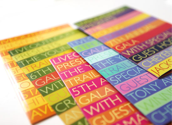
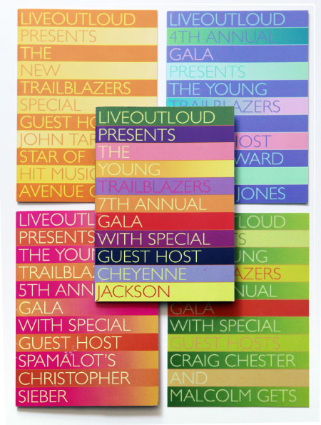
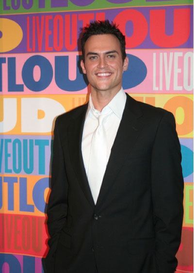
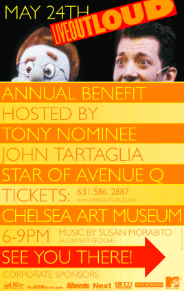
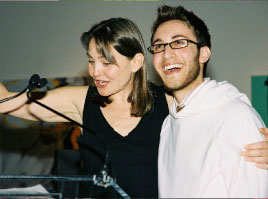
Cheyenne Jackson, 2008 special guest host.

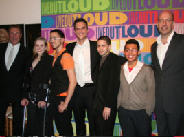
This was Leo's and my favorite backdrop of all the years.

Below is a range of posters from over the years:

posters

posters

POSTER
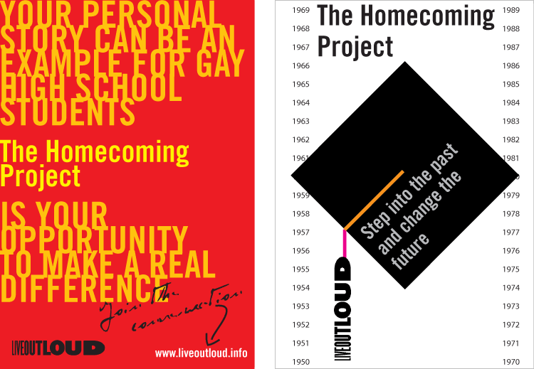
Concepts for the Homecoming Project

posters


aligator shoes


I think of the fashion industry as fiercely competitive. I made the alligator shoes look like alligators to hint at what you might expect when entering it...


poster

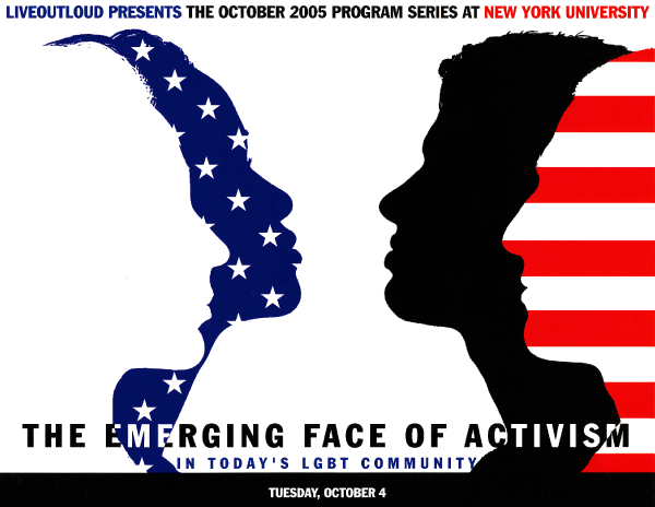
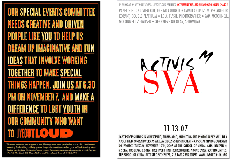
This was the comp for The Emerging Face of Activism poster


I'd like to know if you found any of the content on this page interesting or informative–please click on the smile if you did.

smile000001Thank You :-)