
PRACTICAL EXAMPLE #16 - DESIGN
The brief: A logo.
![]()
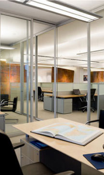
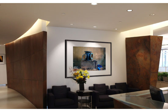
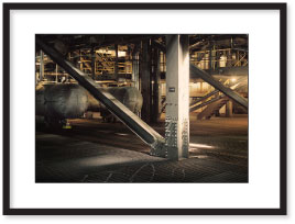
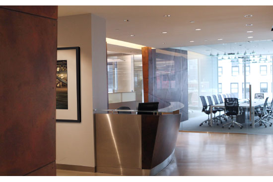
![]() The office interior design was by Stephen Anderson of Montroy Anderson. It was a 10,000ft space, cost $2M and took 14 weeks to do. I was part of the USPG team and helped with selecting the furniture, the glass walls, and some of the light fixtures. When Stephen expressed his intention to create curved steel walls to separate the public areas from the private offices, I recommended Nicolas Fasciano as the artist to fabricate them. He treated the steel with various acids and degrading agents that created an incredibly rich surface which everyone loved.
The office interior design was by Stephen Anderson of Montroy Anderson. It was a 10,000ft space, cost $2M and took 14 weeks to do. I was part of the USPG team and helped with selecting the furniture, the glass walls, and some of the light fixtures. When Stephen expressed his intention to create curved steel walls to separate the public areas from the private offices, I recommended Nicolas Fasciano as the artist to fabricate them. He treated the steel with various acids and degrading agents that created an incredibly rich surface which everyone loved.
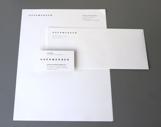
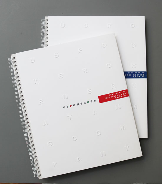
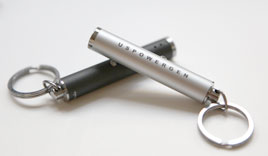
![]() Business stationery
Business stationery
![]()
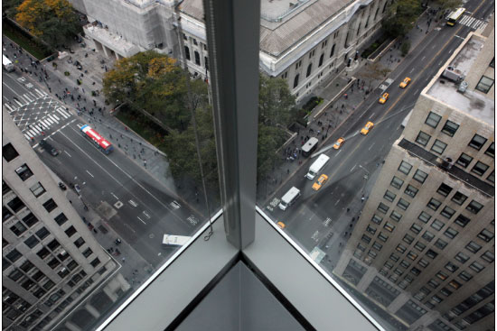
![]() The view from the corner office showing the New York Library, Fifth Avenue and 42nd Street.
The view from the corner office showing the New York Library, Fifth Avenue and 42nd Street.
![]()
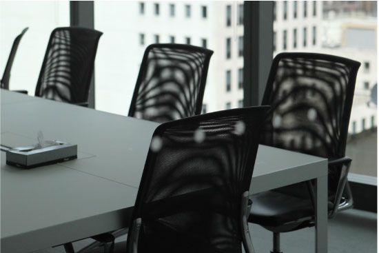
The translucent dividing wall between the two meeting rooms could be made opaque at the flick of a switch.
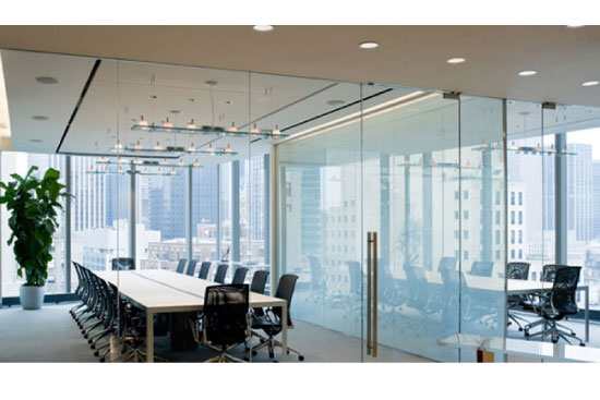
![]() With the exception of the curved sculptural steel walls, all the walls were glass–designed to encourage openness and collaborative work between colleagues.
With the exception of the curved sculptural steel walls, all the walls were glass–designed to encourage openness and collaborative work between colleagues.
 000001