
Peters'


![]() (to come)
(to come)
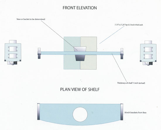
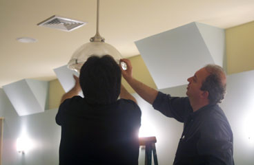
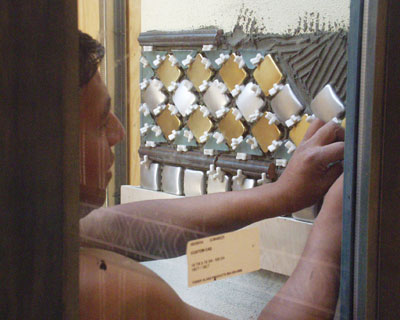
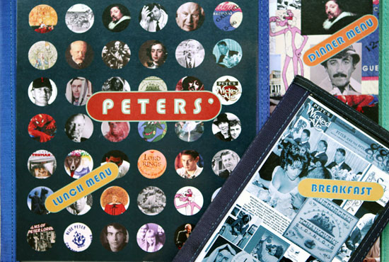
![]() Two-by-two tables are small and need all available space for dishes, so I designed narrow wall-mounted shelves with holes so that they could hold vases full of flowers without risk of toppling off.
Two-by-two tables are small and need all available space for dishes, so I designed narrow wall-mounted shelves with holes so that they could hold vases full of flowers without risk of toppling off.
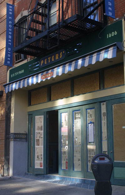
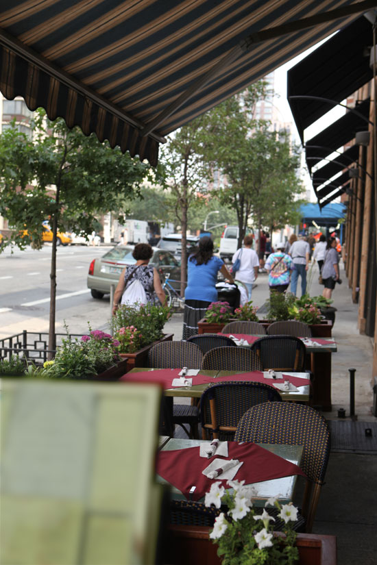
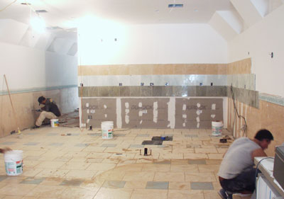
![]() Close to the opening day, the store front and the signage is completed.
Close to the opening day, the store front and the signage is completed.
..............
![]()
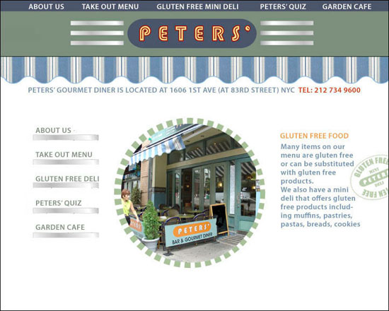
![]() Sketch for the website homepage.
Sketch for the website homepage.
 000001