The thought process

The gift guide is effectively a reorganization and representation of selected products that exist elsewhere in the webstore. The point was to guide the customer to products which Tekserve could definitely deliver in time so as not to disappoint. Again, as with the campaign and the catalog, I wanted to introduce unconventional categories like amusing and amazing, that help the customer find better gifts quicker.

The existing site uses product shots as category buttons, but I wanted more control over the look of the page, both aesthetically and practically. The rest of the site does little to convey the personality of the store. The store is full of antiques and objects collected over the years by one of the owners. The wit and charm of these props is unique and sets the tone for a very personable New York experience. Old typewriters (the ancestors of computers) gave me the perfect idea for buttons.

tshirt
My all time favorite Brooklyn Industries Tshirt

I then looked for something illustrative that felt like winter in New York, but wasn't twee. I was standing at the corner of Central Park across from the Plaza looking up and saw them - pigeons sitting on the wires.

Ordering a paper catalog was to be something like this:

pigeon post

Sadly, the idea of using pigeons didn't fly. So I dropped it and from them on any time an idea was panned I called it a pigeon and we would all laugh.

There's always another way. Snail mail worked just as well as pigeon post.

snail mail

The Extras

After designing the landing page, I looked at what happened when a customer clicked on one of the categories. The page they landed on had no sparkle. It looked the same as the normal category pages and you felt let down somehow. So, to help the category pages look more attractive and at the same time feature and showcase a product, I created banners from the ideas I had used in the catalog.

left arrow
In the corner of each banner ad was the section button to remind you where you were.


The Legacy


left arrow
After the gift guide was taken down, the client continued using the buttons as a means of creating icons for Apps they were offering. As you can see - its easy to make a new one and on almost any subject. After I designed the first few, the inhouse design team ran with them.


What the client said:

Don't know yet - will ask.

Tekserve, Online Gift Guide


PRACTICAL EXAMPLE #15- DESIGN AND CREATIVE WRITING

The brief: Design a landing page for the gift guide that works within the constraints of the existing website.
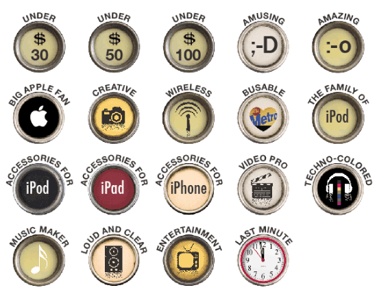
buttons

Gift guide category buttons

up arrow I deliberately varied the degree of wit and ambiguity to better understand the nature of their audience. If a button was never clicked on I would change it for something else.


pigeons
A typical winter view of city birds.

Pigeons are city birds.

landingpage


banner


banner2


banner3


ap buttons


I'd like to know if you found any of the content on this page interesting or informativeā€“please click on the smile if you did.

smile000001Thank You :-)