The thought process

Tekserve were considering trying something different for their holiday campaign. It would mean moving away from using vintage stock images and designing inhouse. Implementing either of the two campaigns I presented meant studio photography. I respected the risk they were taking, and decided to add a few things...

Over and above selling merchandise, I wanted to reposition their store in people's minds, and emphasize how "very" New York they were. I chose only props from within the store and identified people with character traits that resonated with New Yorkers: fashion conscious, creative artists, people with family far away, people with small apartments, and successful big business. I matched each to an age group. Teenagers as the ones making fashion statements, twenties as the artists trying to make it, thirties young parents wanting to share kids development with distant family, forties were the minimalists (men and women) clearing their life of clutter and focusing on what's important; and fifties for making it big in business and knowing exactly what they wanted. I simultaneously linked the most appropriate products to each one.
xxxOriginal comp


I wrote all the copy and even made the product descriptions entertaining and in character. Subway and bus shelter posters afford more reading time than other ads because people are so often stuck waiting, with nothing better to do than read the ads.

In the first ad, the products were all colored technology with all the small copy echoing that. Each product was described in terms of color, the highest being the MacBook which has 16 million colors, the custom laptop sleeve was limited only by your wardrobe, and finishing with the Apple TV which doesn't let cable color your judgement.
xxxOriginal comp
Ad #2 A bonus ad, not asked for. I spotted this amazing product, the iRig, that allows you to plug your guitar into your iPod and turn it into an amp so that you can jam anywhere. I used a stock shot for the musician, but shot the dog, the laptop and the speakers. The dog belonged to the owners of the studio who kindly accommodated my request to borrow him.

turn left at the fish

arrow
The fish and this line described where in the store the AV department is located.
xxx
Original comp
Ad #3. You will see, my baby, my babysitter and the owner of the production company, and a phone-text conversation inspired by my client Geena who had family in Vancouver. I thought you could sell two iPods rather than one, but was careful to inform the customer that you could use FaceTime with a computer too. (Tekserve pride themselves on being trustworthy, and my honesty was in keeping with theirs). The dialog bubbles were a perfect device for this kind of infomation. Folk love to know what others are discussing.

computer

After I showed Geena the ads, she laughed and exclaimed "My sister got us both an iPod Touch for Christmas!" Perfect! I thought.

Ad # 4 I know so many men and women at this point in their lives. Their NY apartment has to be minimal, and the less wires the better. The beautiful handwriting is my aunt Karen's. The yoga lady is the Producer's yoga teacher. She could do anything!

During the campaign, a possibility of a joint social media promotion with Whole Foods arose. I adapted the poster to be hung in their store windows... It read "Tekserve and Whole Foods are now friends. Comment. Like." (just like Facebook)

Why are they friends? you ask. Because they both sell apples.

This is the Wholefoods comp. I changed only one line in the resolutions.
6. Eat only organic food.

both sell apples

xxx
Original comp

Ad #5 I had to come up with a way to sell the new iPad without showing the product because Apple had an embargo on all resellers. I decided to use a BIG guy because of the scale of the new device and I shot him from behind so that you were drawn to look at what he was looking at and what he was thinking. He was the type to know exactly what he wanted - only two things– the new iPad and the top of the line BOSE headphones.

The ad was repurposed for the Wall Street Journal to promote a corporate gift event. I changed the headline to:

From one big fish to another.

Post Christmas Ads # 6 & 7
An addition to my If Only... campaign I had presented as the alternative choice for the holidays. Although they worked independently, they were designed to sit together.

xxxxxx

Continuing the chair theme, the egg chair from the store is one of their most iconic pieces. These two ads were, for me, the most visually grabbing. Ideal for a double width telephone kiosk spot because they call so much attention. The eggs with legs made you smile even before you read the copy.

The ticket the guy is holding is a unique system used instore so that you don't have to stand in line.

I suggested a repurposed version of the Egg Lady for April in case they wanted to jump on the Chocolate Egg bandwagon...

chocolate egg alt


Ad #8 I thought a strong market for Apple TV was parents of kids under five, as most of them still protect them from commercial TV. I knew that schools in the area were over subscribed which meant that the neighborhood had plenty of possible customers.

comp

The ad features my son, PJ, who only watches dvds and shows I choose from Netflix.


Ad # 9 The company became a Verizon reseller in Febuary, 2011. This ad was conceived in anticipation of that development and was held over to run in May, when Tekserve had all the new mobile media product releases.

Photographer for this series of ads was Robert Christensen who was great to work with. He was enthusiastic about the ideas and focused enough to get through the enormous shoot list in one day. Production company was Picture Farm. They were highly recommended and worth every bit of praise.


Tekserve's previous year's e-waste image:

original

left arrow

The Tshirt had to be green to make the headline work on two levels. My idea for the Tshirt design was an adaptation of the iconic I Love NY logo by Milton Glaser. I kept the integrity of the original design by keeping it "a word, a symbol and an acronym." I turned the recycle symbol upside-down so that it looked more like a heart. I felt it didn't lose any of its familiarity, and nobody noticed it was upside-down. Implicit was the idea that I recycle New York because I love New York.

ilove ny +recyle symol


green t


down arrow
Sometimes an ad is just as important internally. When Tekserve got the iPhone4 it was a big deal for them. iPhones were the only Apple product that they hadn't offered up to that point. Their new association with Verizon that facilitated it.

Being a reseller meant that they wouldn't have the iPhone4 first. But, as a way to promote the arrival, I thought they could make a celebration of it. I took a cue from Alice in Wonderland where the Mad Hatter celebrates his 364 UnBirthdays and came up with this concept, thinking that they could have fun with the promotion internally (ie make it last a month if it worked) while also involving their neighbor Whole Foods who could supply the tea and cupcakes.

xx


left arrow
Two mobile products, the 5 spot and the mobile modem are particularly suited to families with weekend homes who want internet access when they are there, but don't want to pay for it when they are not.


Let Tekserve take care of you.

Another attractive proposition for anyone who has been burned trying to save money on technology... After that experience you want to be looked after by a company you can trust, one that will take care of you.


left arrow
When the new MacBook Pro came out, I adapted a concept which I first used in the gift catalog, based on local knowledge and playful and eyecatching at the same time. Man's best friends subtly reinforced the trustworthy nature of Tekserve as well as the product.


Tekserve Pro

I changed the color of the border and made a small addition to the logo to differentiate Tekserve Professional from the rest of the company.

Tekserve Pro is the division that caters to professional broadcasting companies. The placement of the first ad was going to be within a Mobile Sports Broadcasting Journal.

I was briefed that they wanted to achieve a high volume of calls for appointments, and also told that their favorite image was the logo page in their brochure. (below)

logos

To me the logo page looked rather like a list of sponsors and didn't really mean anything. Listening to how they described their expertise, I created this strategic ad (pro#1) and copy line to reinforce the message. And, to encourage people to call and to plant the idea that they are intelligent I made the call to action less intimidating by suggesting that you could call and just pick their brains.

I knew that once a customer started talking with one of their team, they would quickly establish trust and depth of knowledge and in their friendly way, invite a consultation appointment. It worked, and I learned they received more calls than ever before.


left arrow
Repeatedly positioning Tekserve as the company you can trust, inspires responses like the Harry Potter ad (far left). My understanding of 4G technology was that if you could watch a Hi-Definition movie on a fast moving train, you weren't going to need the Best Buy Buy Back deal. A wise messenger from Harry Potter, the quirky popular icon, was well suited to convey the message.


Tekserve Advertising


PRACTICAL EXAMPLE #13 - DESIGN, ART DIRECTION AND COPY WRITING

The brief: Holiday, subway poster and postcard campaign.

Measured success: The postcard campaign produced a 66% spread in sales between the control group and those who received the mailing three times.

xxx

Ad#1 For that Tecno Tribal Vibe
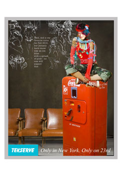
My 20 year old niece, Kayla Stuhr, did the illustrations. An art student herself, I thought of her as the real version of this girl and, in my mind, this made the drawings even more authentic. The 20 year old model also felt that this was exactly her style.


xxx


xxx

ipod detail
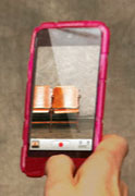
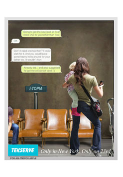
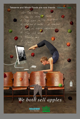
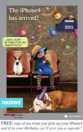
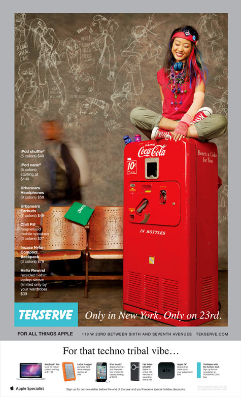
Detail on the iPod. The chairs are one of the things the store is known for. Even Sex in the City had Carrie visit Tekserve and sit and wait for service like so many of us Mac lovers.


xxx


xxx


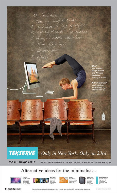
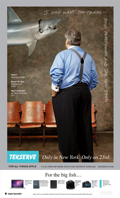
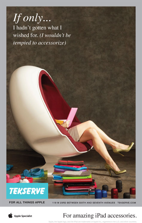
Additional ideas, at my suggestion, addressed what happened after Christmas. Either you got what you asked for or you didn't...

ipad

accessories


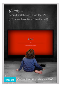
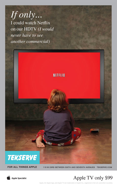
I overheard someone explaining that Apple TV let you watch any online TV including Netflix. I thought this was amazing and far more likely to sell the device than Apple's version, because everyone knows Netflix and the possibililty to watch it on your HDTV was very attractive.

Apple Tv Netflix


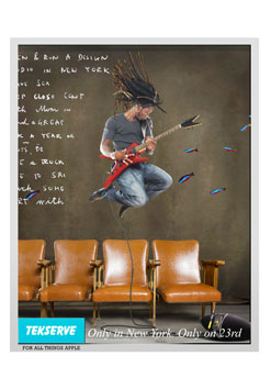
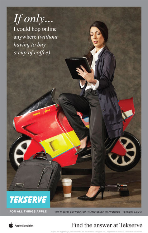
I had another idea for mobile technology. The most common experience, that everyone was familiar with, was having to buy coffee at Starbucks or a cyber cafe for wifi access...


mobile technology


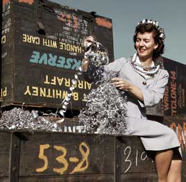
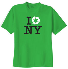
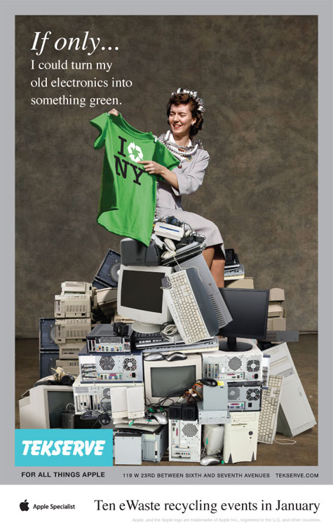
After all the shots from the October shoot had been used, we moved on to their e-waste campaign and for this they wanted to reuse a vintage image. I felt that although the girl was OK, the rest of the image did nothing for them. Using the brown background from the recent campaign I composed a new image with their vintage girl sitting on a pile of stock shots of old electronics. A new copy line and a new T-shirt design completed the proposition.

e-waste


stock
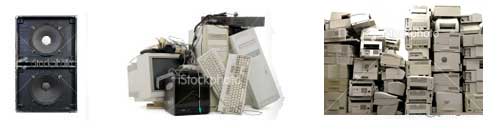
Some of the images before I composed them


The legacy of the campaign.

What happened next. The client didn't have a budget for ongoing studio photography so I used my imagination and magical retouching skills to compose inexpensive stock images on my distinctive background to maintain continuity.

xxx
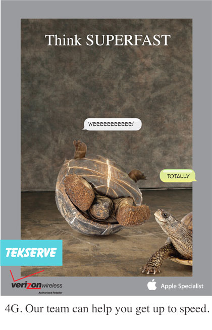
Ad introducing 4G mobile technology

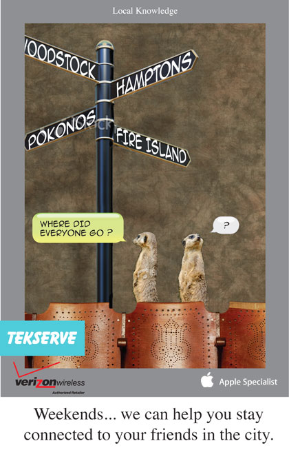
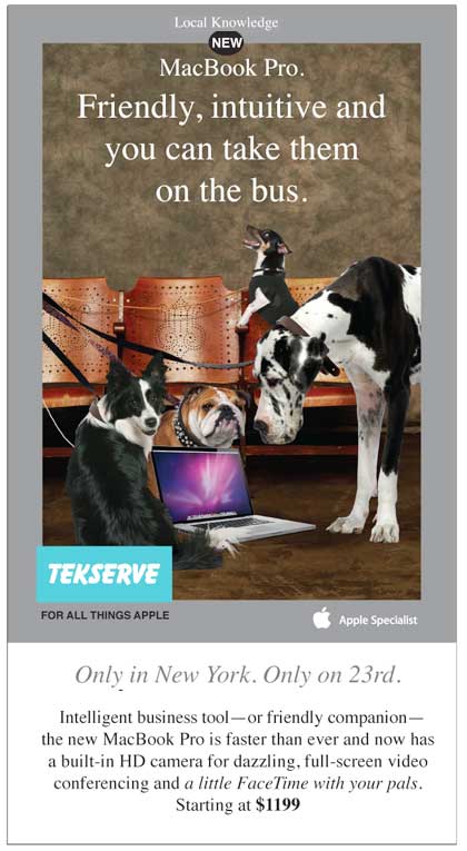
The Local Knowledge series continued the idea of exploiting things only New Yorkers understand, e.g. how after Memorial Day the city is practically empty on the weekends because so many leave for the country and the beaches. Or (below) if your dog fits in a handbag you can take it on the bus...

xxx


xxx


Tekserve Professional Journal Ads

xxx
pro#1 Game Plan

ad 1...ad 2

ad 3..ad 4


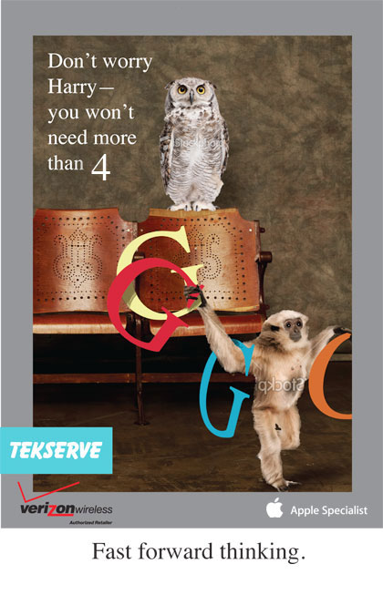
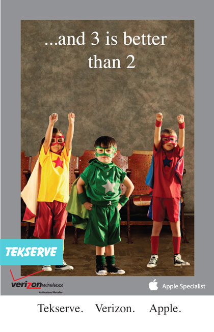
Sometimes creative ads need to be turned around immediatly in response to competitors. The following two comps were immediate responses to the Best Buy and Apple ads below.

buy back
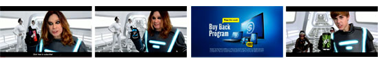
Best Buy Superbowl ad: G4... G5... G6... Buy Back program

two better than one
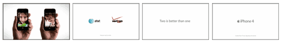
Apples introduction of iPhone4 with two service providers... Two is better than one

thre better than two..thre better than two


I'd like to know if you found any of the content on this page interesting or informative–please click on the smile if you did.

smile000001Thank You :-)